Brand & typography
From one word to a visual identity: designing with a custom display font
By Fontir · · 5 min read
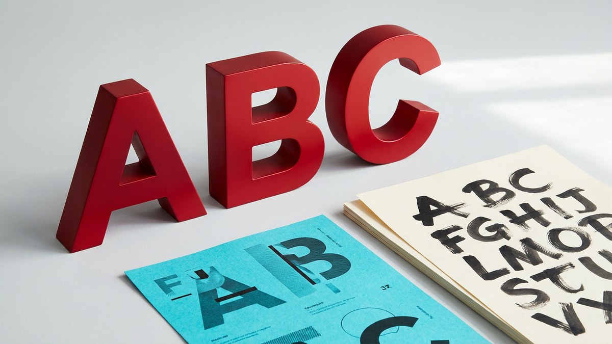
A custom font does not have to do every job in a brand. Sometimes its best role is to make a few words unmistakable: the name on a poster, the title of an album, or a recurring campaign headline. Treat it as one part of a visual system, and a single expressive word can become the starting point for a much more coherent identity.
Choose a job for the font
Before generating, decide where the lettering will live. A short headline can tolerate elaborate shapes that would be tiring in a paragraph. A small label needs clearer silhouettes than a large album title. Set a primary use first; it gives you a concrete way to judge the result.
Write down three qualities you want the typography to communicate—perhaps angular, restrained, and industrial, or soft, playful, and handmade. These are creative constraints, not universal rules about what a serif or a rounded letter means. Pick a reference that expresses your particular combination.
Build a family, not a collection of impressive letters
A strong A is not enough. Compare recurring features across the set: stroke thickness, corner treatment, round shapes, and the way strokes end. A family should feel related even when the letters have very different structures.
Fontir generates multi-character sets together in a whole-font image before separating the letters. That gives the set a shared visual starting point, but you still need to review the result. If one letter feels unusually heavy, narrow, or ornate, refine that letter rather than accepting the inconsistency.
Use real language as your design test
Start with your brand name or the exact headline you intend to use. Then try a longer phrase, a repeated letter, and a word containing round and diagonal forms. These reveal spacing and rhythm problems that an alphabet specimen can hide.
Change the preview font size and letter spacing to explore the composition. Do not assume a spacing adjustment in the generator will become kerning in the exported font: preview controls help you inspect the design, and the final layout still needs checking in your design application.
Pair expressive lettering with quiet supporting type
Use the custom display face for the moments that matter, and choose a familiar, readable typeface for captions, navigation, or longer copy. The supporting font should make the content easy to read rather than compete for attention.
Keep the number of type roles small. A practical starting system is one display style for titles, one supporting face for text, and a consistent treatment for labels. Repeat these roles across a poster, a social image, and a mock product label to see whether the identity holds together.
Test the exported font, not only the preview
Install the selected TTF and check the exact wording at its intended size. If your design depends on color and material, confirm that the destination application displays the 3D color font correctly. If the typography will be enlarged heavily or used as a simple silhouette, test the 2D vector version instead.
Keep your reference, exported archive, and the included generated-font license with the project. Do not assume generated lettering is exclusive, trademark-clear, or a substitute for checking the rights in your source material. A polished identity includes a sensible production and rights review—not just a striking image.