The creative process
Better references, better letters: a guide to image-to-font generation
By Fontir · · 5 min read
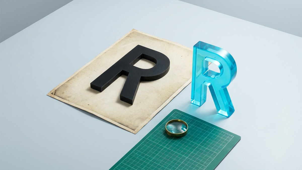
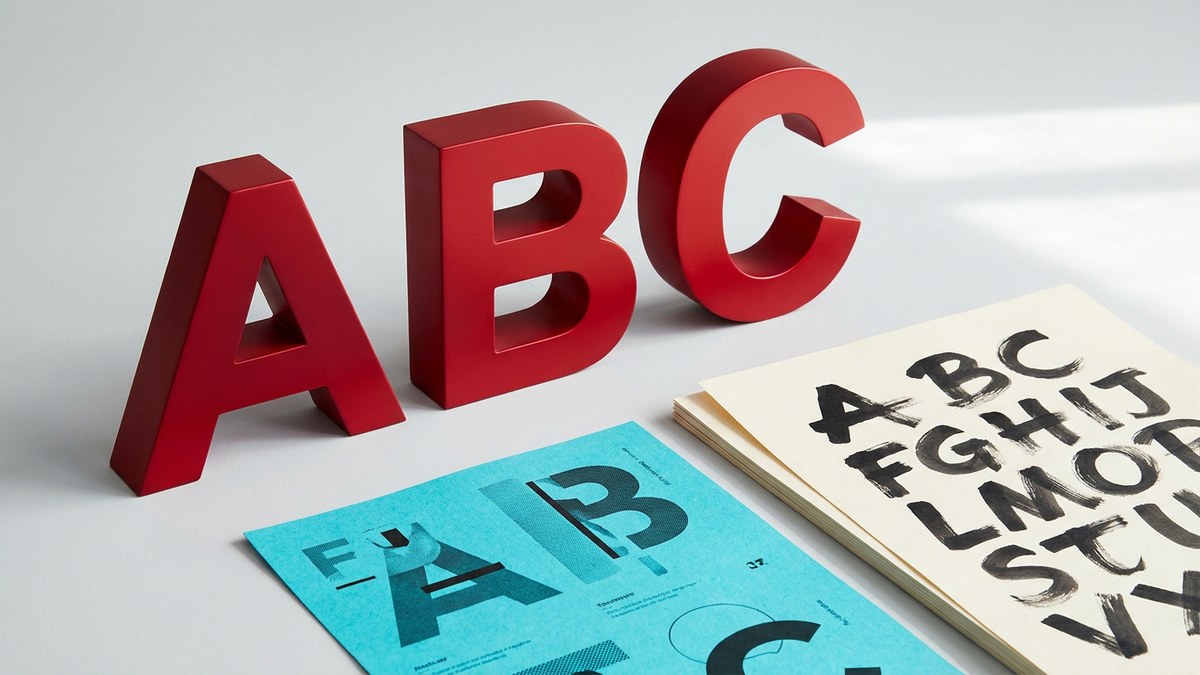
A memorable font often starts with one good image: a hand-painted sign, a piece of lettering, or a carefully drawn specimen. The trick is to give the generator a clear view of the letters—not everything around them. Here is a practical way to turn a visual reference into a more useful starting point for your own typeface.
Let the letters be the subject
Choose an image where you can clearly see the strokes, terminals, and empty spaces inside the letters. A flat, front-facing specimen is easier to judge than a photograph taken at a steep angle. If you are photographing your own lettering, use even light and avoid glare that hides the edges.
Crop away unrelated illustrations, surrounding headlines in other fonts, and busy scenery. Leave a little room around the strokes so flourishes and descenders are not cut off. The aim is clarity, not an extremely tight crop.
Give the style more than one clue
A single striking letter can suggest a mood, but several different shapes give you more to evaluate. If available, include a round letter such as O, a diagonal such as A or V, and a letter with a distinctive terminal such as R. For a lowercase style, letters such as a, g, and y reveal details that capitals cannot.
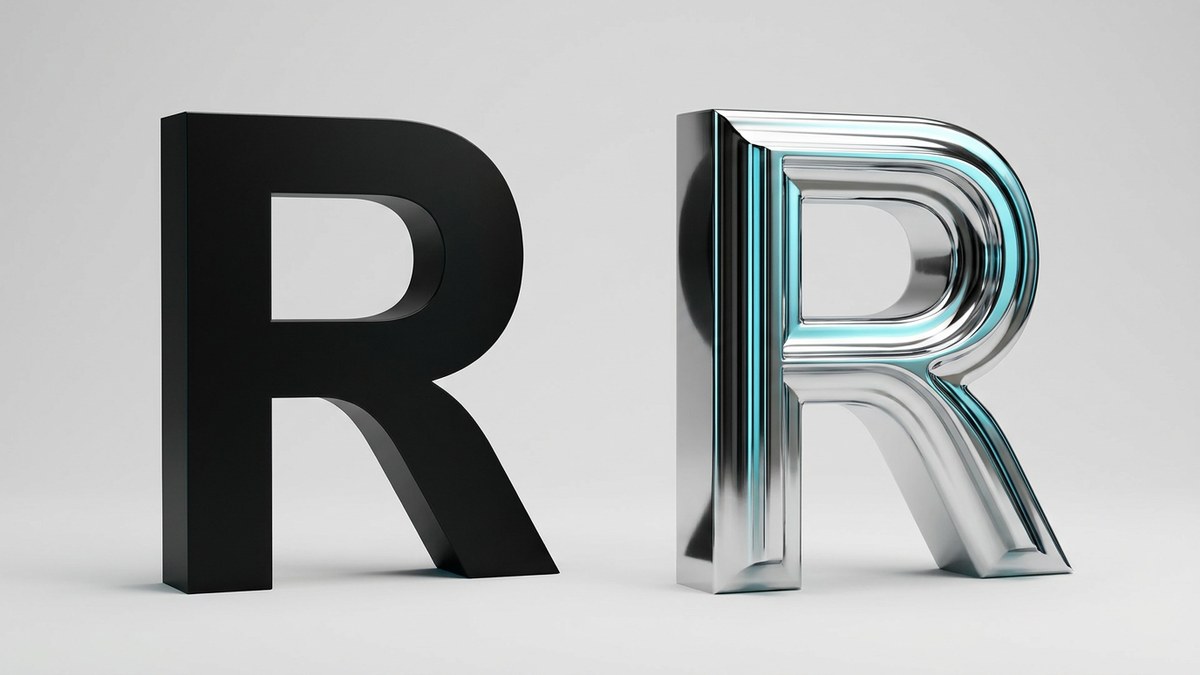
Use a reference with one coherent style rather than a collage of unrelated fonts. If the reference is textured or dimensional, make sure the letter shapes remain readable beneath the material. Metallic shine should not disguise the difference between a stroke and a hole.
Start with the character set you actually need
In Fontir, upload a PNG, JPG, or WebP reference and choose the full A–Z, a–z, and 0–9 set, or a smaller set of capitals, lowercase letters, or numbers. A capitals-only set can be a useful starting point for a poster headline; mixed-case copy needs the corresponding lowercase characters too.
The generator creates new letterforms inspired by the reference. It is not a font-identification service or a promise to reproduce an existing typeface exactly. Start with your own lettering or material you have permission to use, and review the generated-font license before using the result.
Review shapes before falling in love with the texture
Try a real word from your project in the preview, then inspect the individual characters. Look at the open spaces inside A, B, P, and R, the relationship between narrow and wide letters, and whether diagonals feel like part of the same family. Switching a dimensional font to 2D is a useful way to judge its silhouette without the shine.
Regenerate a specific letter if it breaks the style. A beautiful material cannot rescue an unreadable shape. Once the set works, download the selected TTF and test it in the application where you plan to use it.
- Letters are sharp enough to inspect at the reference's original size.
- No important strokes or flourishes are cropped out.
- The reference shows a consistent style without distracting graphics.
- Your chosen character set covers the words in your design.
- Counters, baseline, and spacing look sensible in an actual headline.