Inside the font
Sharp silhouettes or chrome shine? Choosing 2D and 3D font exports
By Fontir · · 6 min read
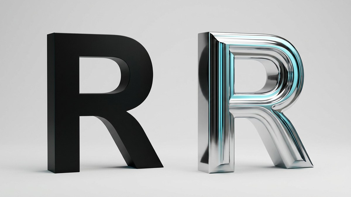
Two files can both end in .ttf and still draw letters very differently. One can describe the outline of a shape; another can also carry color pictures of the glyphs. Understanding that distinction makes it easier to choose between a clean black silhouette and a dimensional font with its texture intact.
2D: outlines that can be scaled
Fontir's 2D export turns the generated letter silhouettes into TrueType vector outlines. The outlines describe contours with points and curves rather than storing the visible letter as a fixed grid of pixels. They can be rendered at different sizes without simply enlarging a small bitmap.
Vector does not mean automatically perfect. An outline traced from a weak or low-resolution source can still contain awkward bumps, missing holes, or uneven curves. Enlarging it will reveal those shape problems. Fontir traces the generated letter crops using fitted curves, but inspect the exported result before committing it to a large design.
The 2D selection removes the generated color and shading. It gives you a monochrome shape; the application where you typeset it can usually apply its own text color. Use this mode when you want a simple silhouette or need predictable scaling.
3D: pictures inside a font
Fontir's 3D export preserves the generated colors, highlights, and shading using PNG glyph images in an OpenType sbix table. It is still an installable TTF, but its dimensional appearance comes from images, not editable three-dimensional geometry.
The export uses glyph pictures at a 1024-pixel cap height. That is useful detail for many display layouts, but these are still finite-resolution pictures. Enlarging them far beyond their stored size cannot create new detail. Upscaling an image also cannot recover texture that was missing in the generated source.
Unlike a monochrome outline, the material is baked into the pictures. Do not expect changing the text fill to recolor chrome reflections or independently edit the lighting. Choose 3D when the generated appearance is an important part of the composition.
Why a color font can appear black
Color-font support depends on the application and rendering environment, not just the .ttf extension. The OpenType specification allows sbix bitmap data and outline glyphs to coexist. If your destination does not display the color images, you may see the outline fallback rather than the intended texture.
Test the font in your actual workflow before sending it to a collaborator or printer. Check the same word in the generator and in the destination application. If the color appearance is missing, do not assume the download is broken solely because the outline is black; first establish whether that application supports sbix color glyphs.
A quick choice for your next project
Choose 2D for a silhouette-first logo study, very large lettering, or layouts that need a single controllable text color. Choose 3D for a headline where chrome, glass, or another generated material is the point, provided your destination displays the color font correctly.
In Fontir, select the Font Look you want before downloading. The download contains only the selected version in Fontir.zip, with Fontir.ttf and the generated-font license. If you need to compare both modes, change the selection and download the other version separately.
- Check that the exported font contains the characters you need.
- Inspect closed counters and diagonal outlines at your target size.
- Verify 3D color rendering in the destination application.
- Keep the included license with the downloaded font.